UX DESIGN
Filtering by Tag: cognitive
OLLI | AUTONOMOUS FOR ALL OF US
Denise Francis
BRIEF
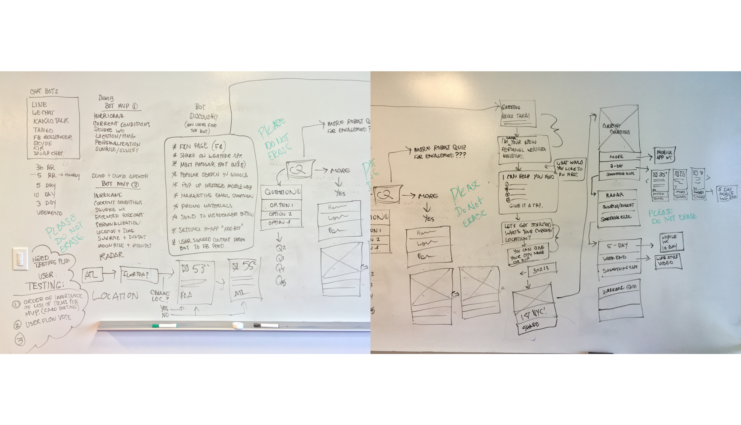
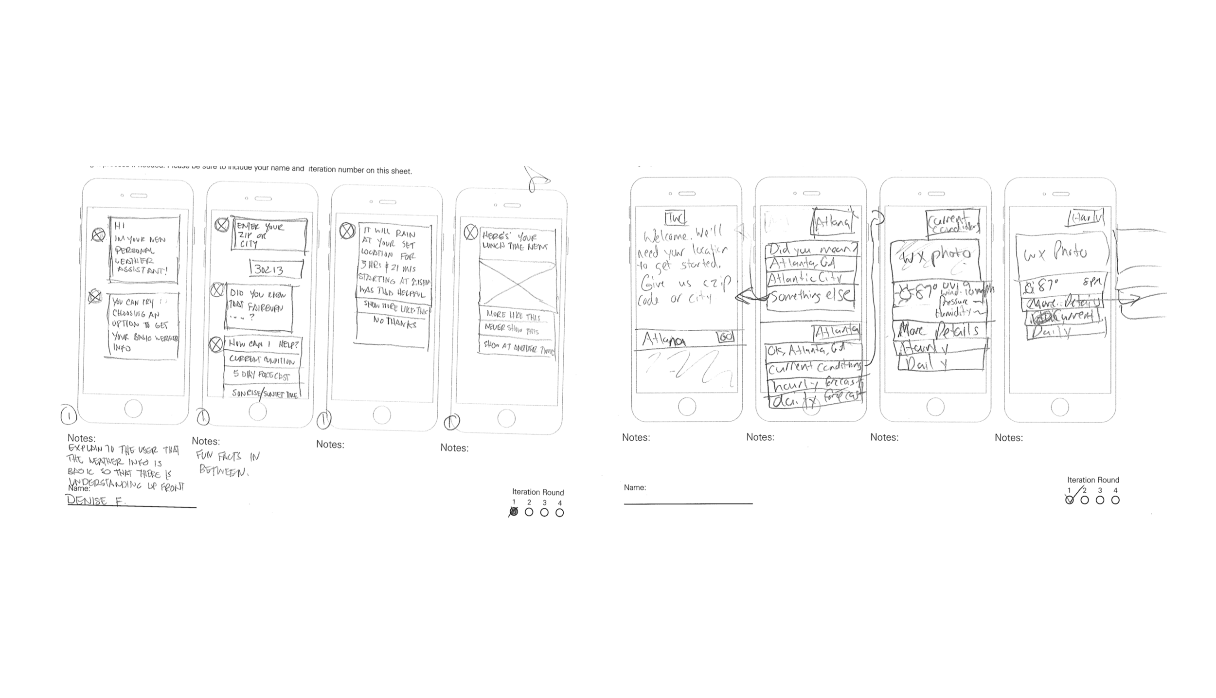
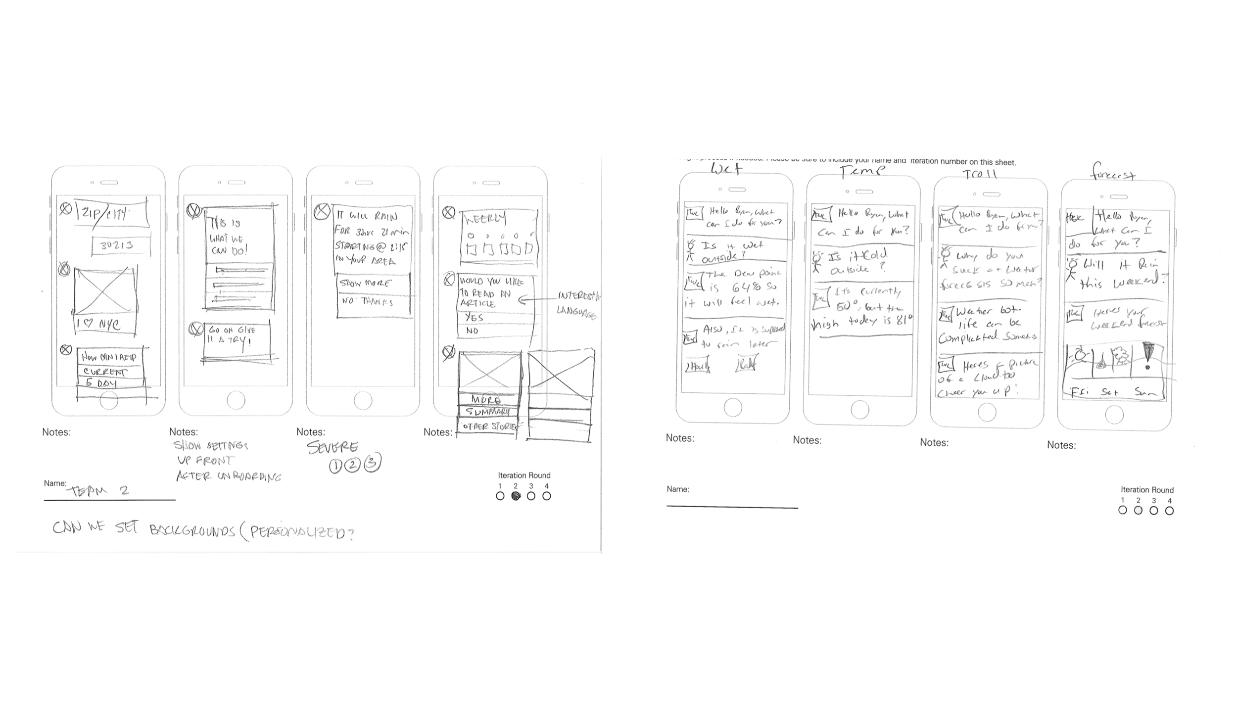
The Weather Channel Facebook Messenger Bot is the best weather bot option for accurate forecasts and timely local weather alerts. It allows users to make confident decisions whether planning for the day, entire week, or extended forecast.
MY ROLE
Product Designer. Most would recognize this role as a full stack UX|UI designer. Responsibilities included conceptualizing a weather chatbot from start to finish, including the user experience flow and the visual direction under the limitations of Facebook's platform. Also included assisting in the development of the bot's tone (which sparked a larger conversation about voice tone throughout The Weather Channel's brand), as well as solving user conversation habits and challenges that allowed the user to speak freely, display trust, and understand the difference between a pure human vs. robot conversational experience.
METHODOLOGIES
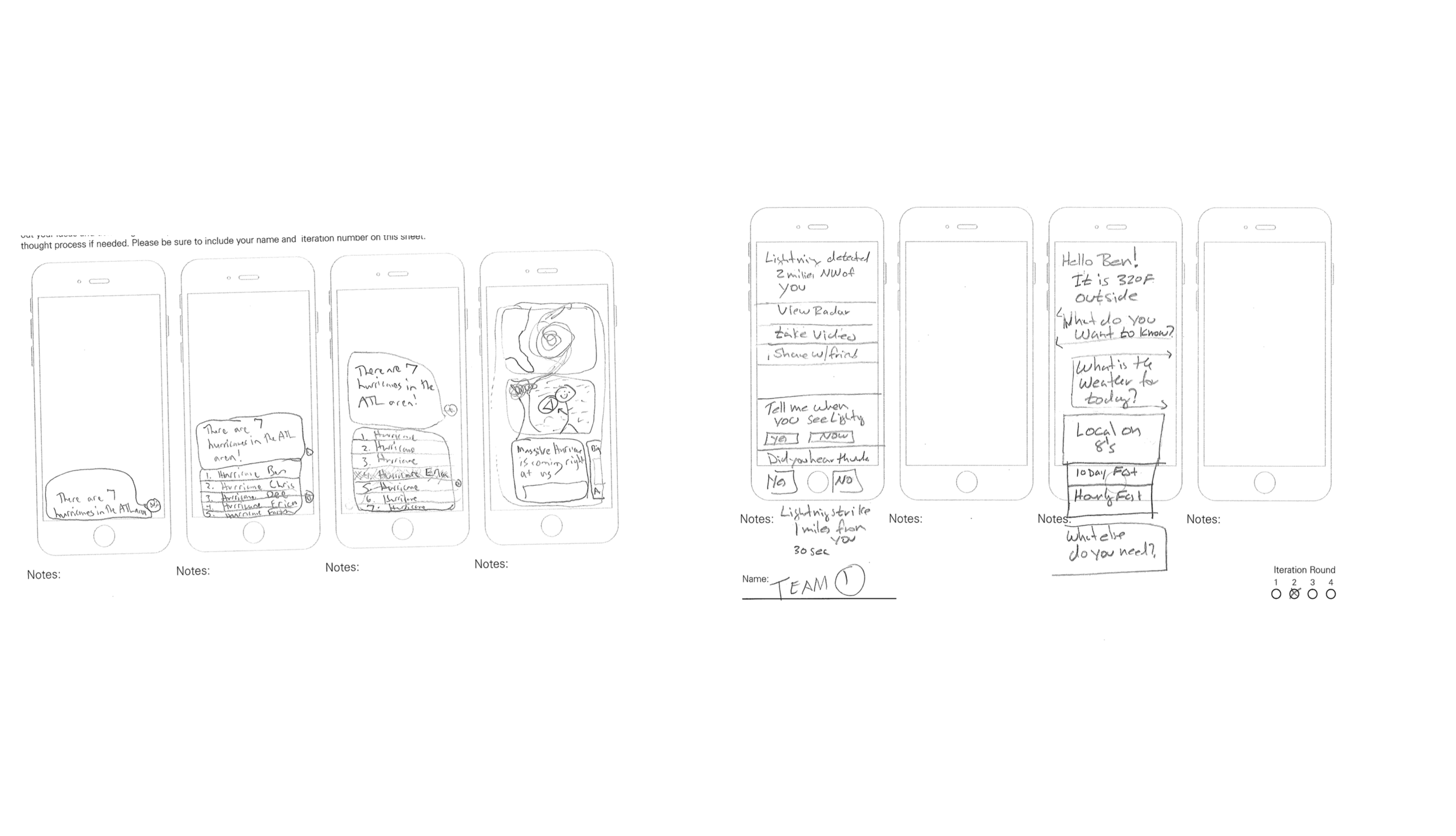
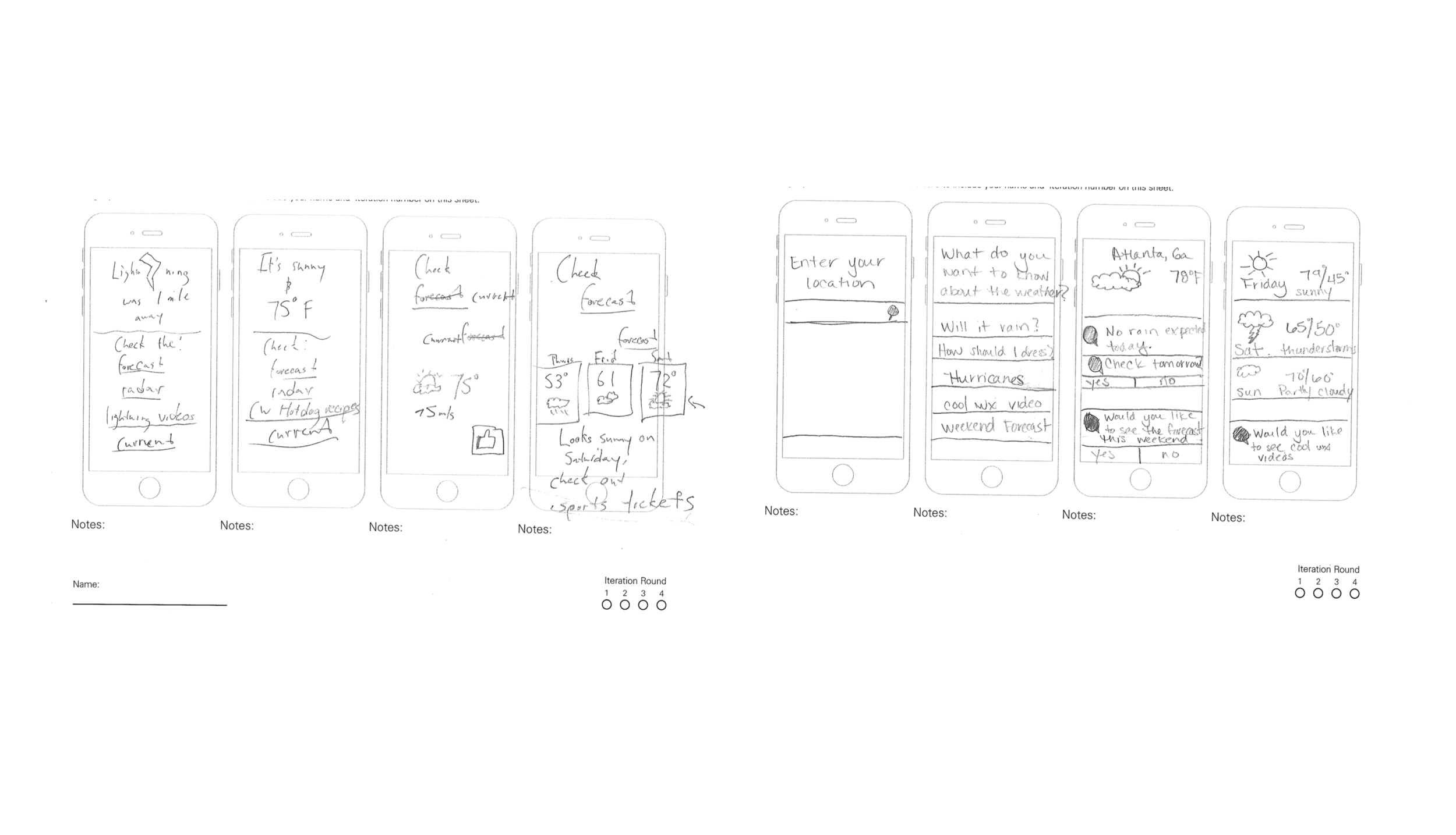
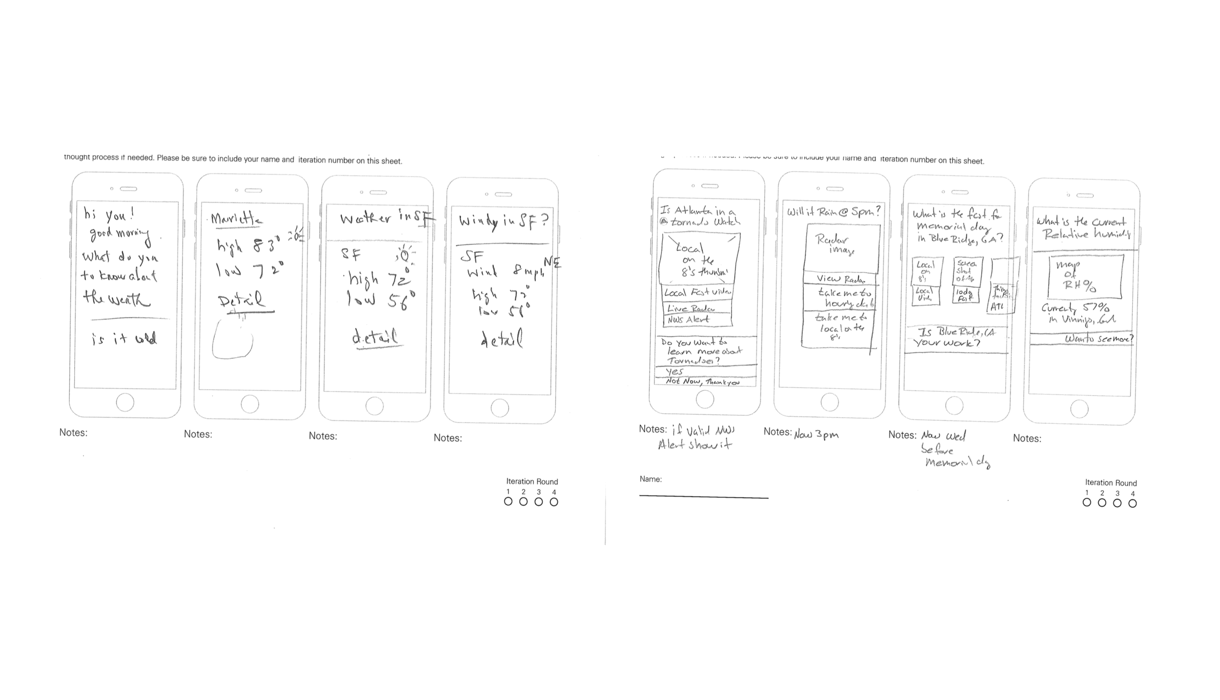
Guerrilla Tests, Personas, User Flows, Extensive Market Research, Sketching, Live Prototyping, Comparative & Competitive Analysis, and Wizard of Oz User Testing.
TOOLS
Sketch, Facebook, Google Suite, Adobe Illustrator, and Adobe Photoshop..
What is a chatbot?
So what is an autonomous vehicle? Well. We finally have self driving cars. And they are finally getting good.
So typically as a public commuter there are several steps to getting to and from various destinations. Olli makes it easy by creating routes that allow for simple navigation, departure and arrival to your destination.
Now imagine that you have an ailment that extremely slows down your travel making it hard to navigate the world. What would be some of the things you’d have to think about? We empathized with this mindset and began to pin point the pain points and concerns so that we could begin to create the right solutions.
So we started to think about some of those pain points and how we can solve them via the technology and physical spaces available to us using the screens at the bus stop and on the bus
We began to sketch and brain storm all while checking in with our engineers to ensure that we could reach an MVP that would’t frustrate its users, knowing that this will ALWAYS and continue to be a learning process.
We then began to set the mood by exploring materials, textures, tactile engagement
We incorporated systems into those screens and monitors to allow users to communicate and gain information in ways thats best for them.
From there we arrived at a flow that supported our initial MVP to be tested at an up coming CES Conference.
The we put it in front of people. Spectators got the opportunity to meet various user personas and experience the vehicle. Designing for an exhibit (approximating a real life experience within the constraints of an exhibit hall booth) as well as a real life actually-in-use experience.
And there's always that moment when you get the ultimate user testers … Exciting!
This project taught us a lot about execution but it also was a huge lesson in just how much communication can improve a product.
NOBODY KNOWS OR CARES ABOUT THE SILOS WITHIN YOUR COMPANY.
It’s not black and white. It is so important to design a product that everyone can use. Learn about color contrast rules and font weights and sizes. Disabilities range from temporary issues like headaches, to a broken hand. There’s also a legal mandate to comply with certain accessibility standards.
Name Headers
Describe Images
Color Contrast
There are so many screens, too many clicks to find what you need. Make that the priority then make a second step. Try to avoid exhausting the users.
What user need are you solving? Never forget what you’re helping users achieve. You are their advocate!
We got the opportunity to present this project at the 2018 We Rise Tech Conference in Atlanta, Ga. and look forward to presenting it at more conferences in the future.
